Oporto
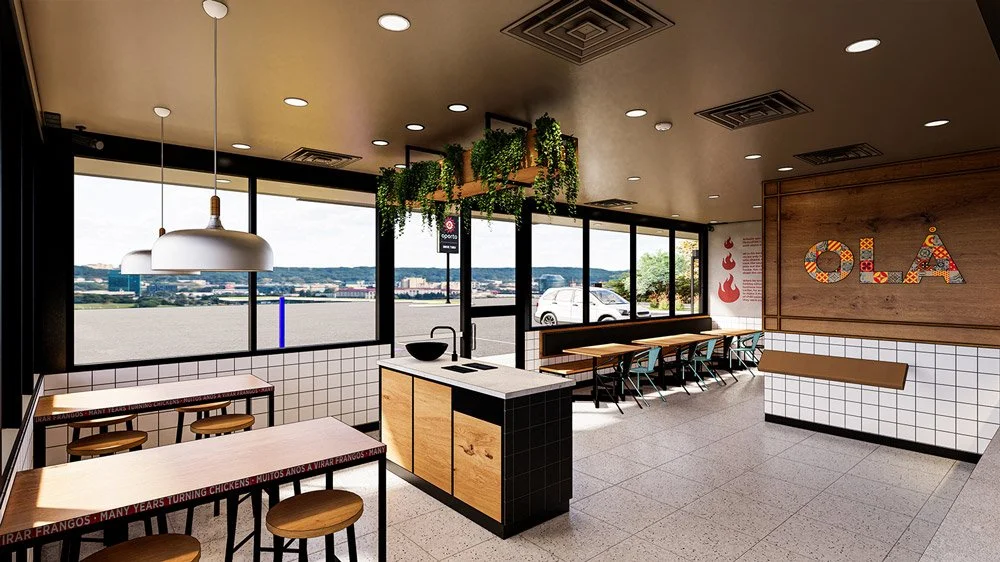
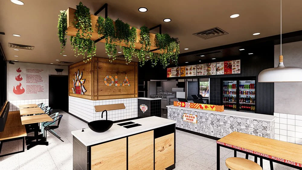
The rebrand of Oporto was to include in the design, a strong Portuguese influence. Craveable Brands wanted to take the brand back to its roots, and reawaken the customer journey throughout the space. Contemporary Portuguese tile patterns and motifs in blues, yellows and reds, juxtaposed with greening elements (Portuguese country side) help create an inviting and activated space.
These elements backed up with black steel mesh, white tiles and neutral colours. The kitchen and back of house elements have been partially opened up to introduce a degree of theatre and allow the waiting customer to take part in the food preparation process.
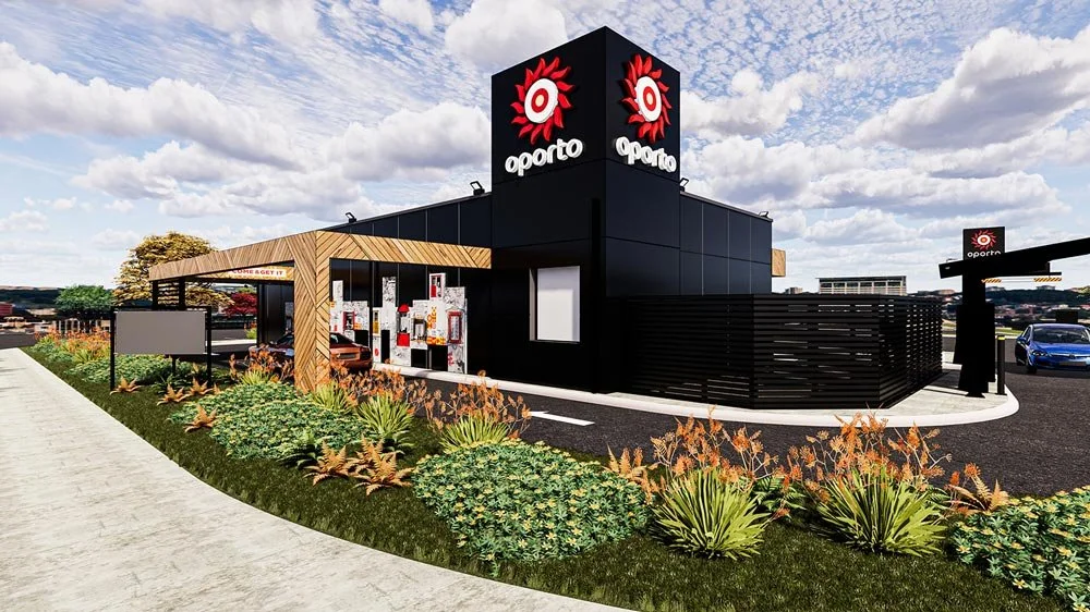
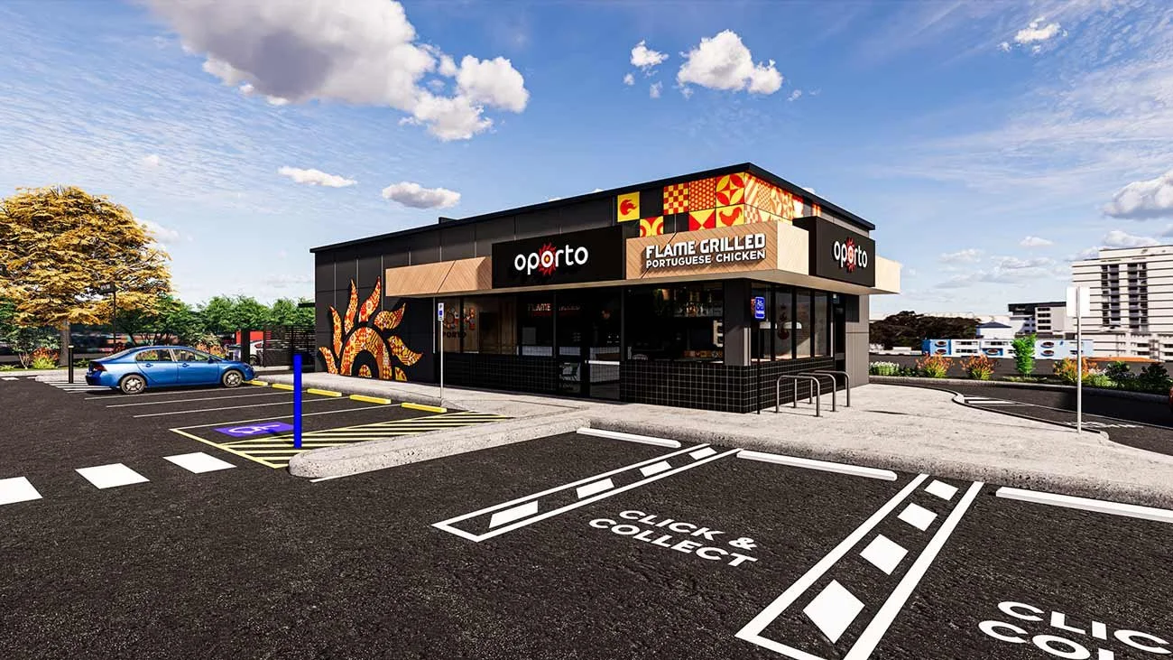
Real and natural elements i.e. the timbers internally and black vertically cladding on the exterior combine with the colour pops to create a fun, energetic and balanced overall palette.
LOCATION
Braham WA